Edge of anarchy
branding | visual identity
-
Design an identity for the World’s End Festival, an event that promotes the values of self-expression, self-discovery, community and participation.
-
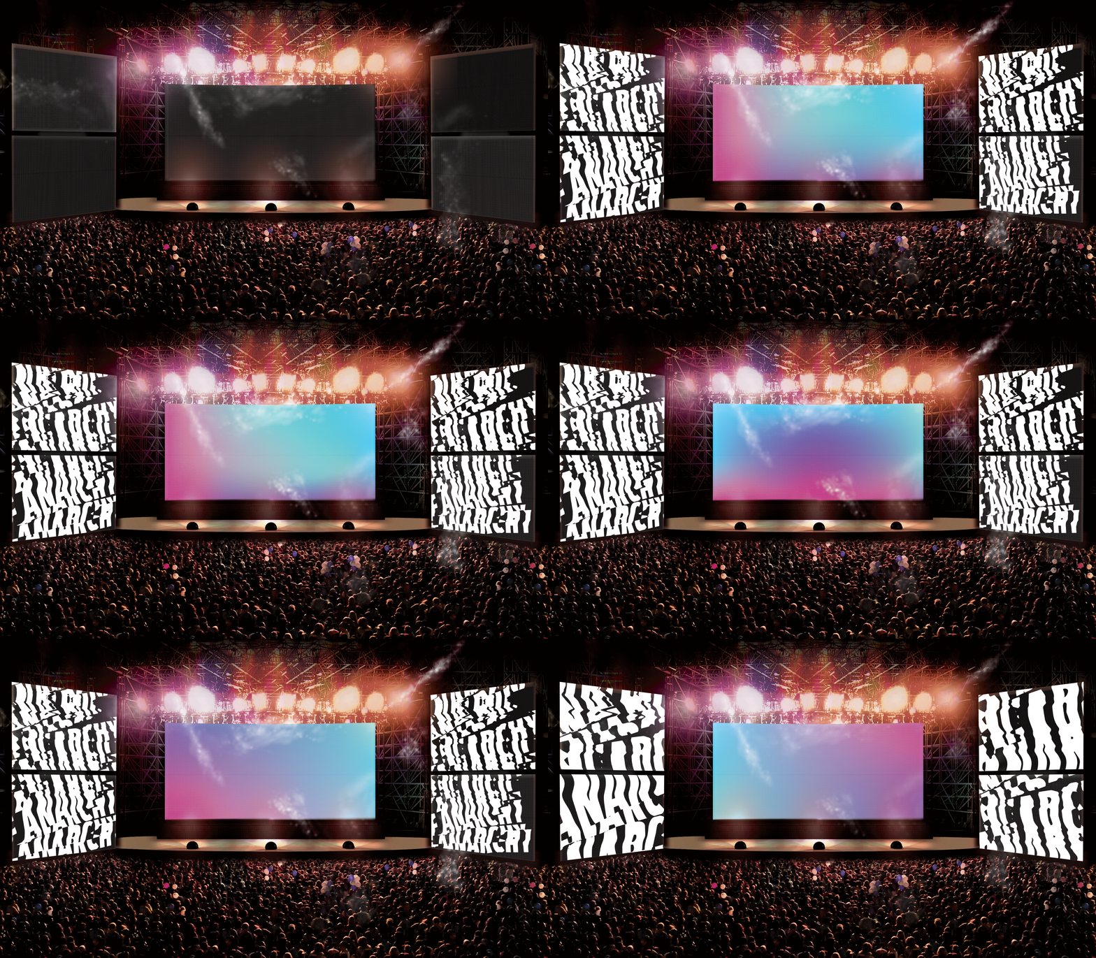
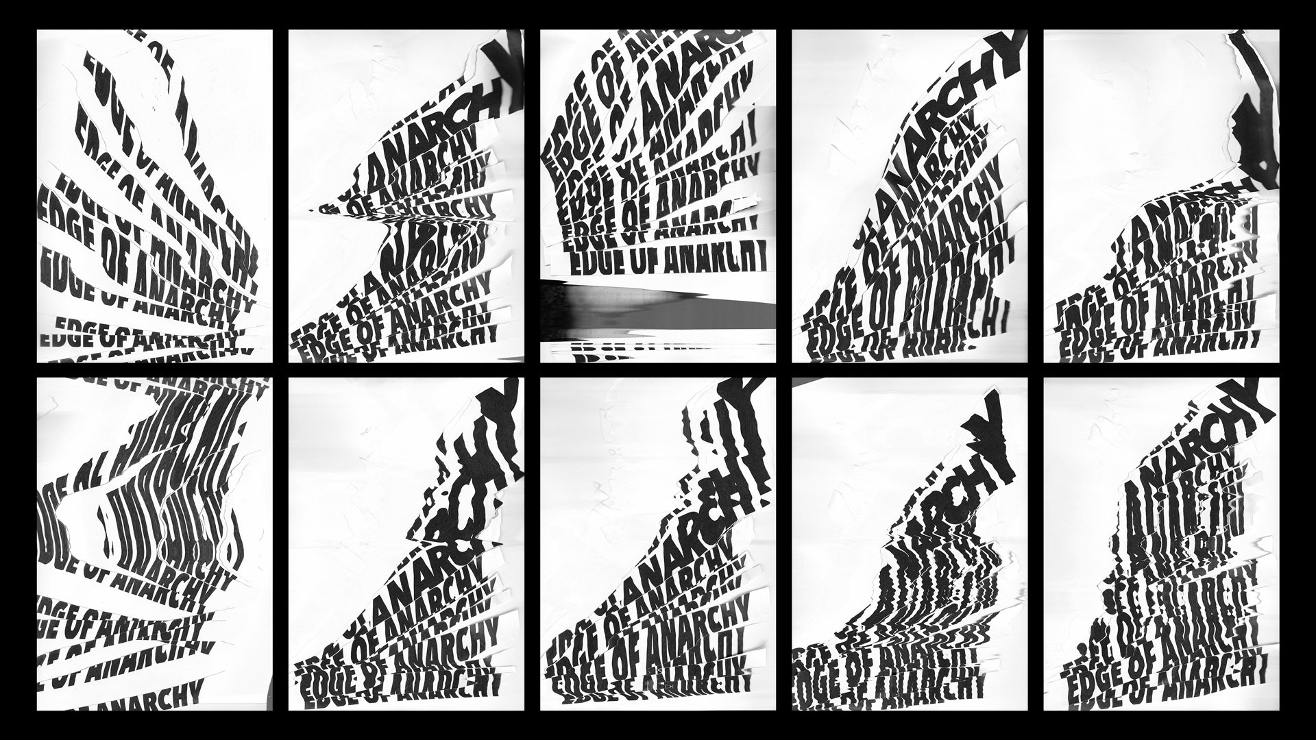
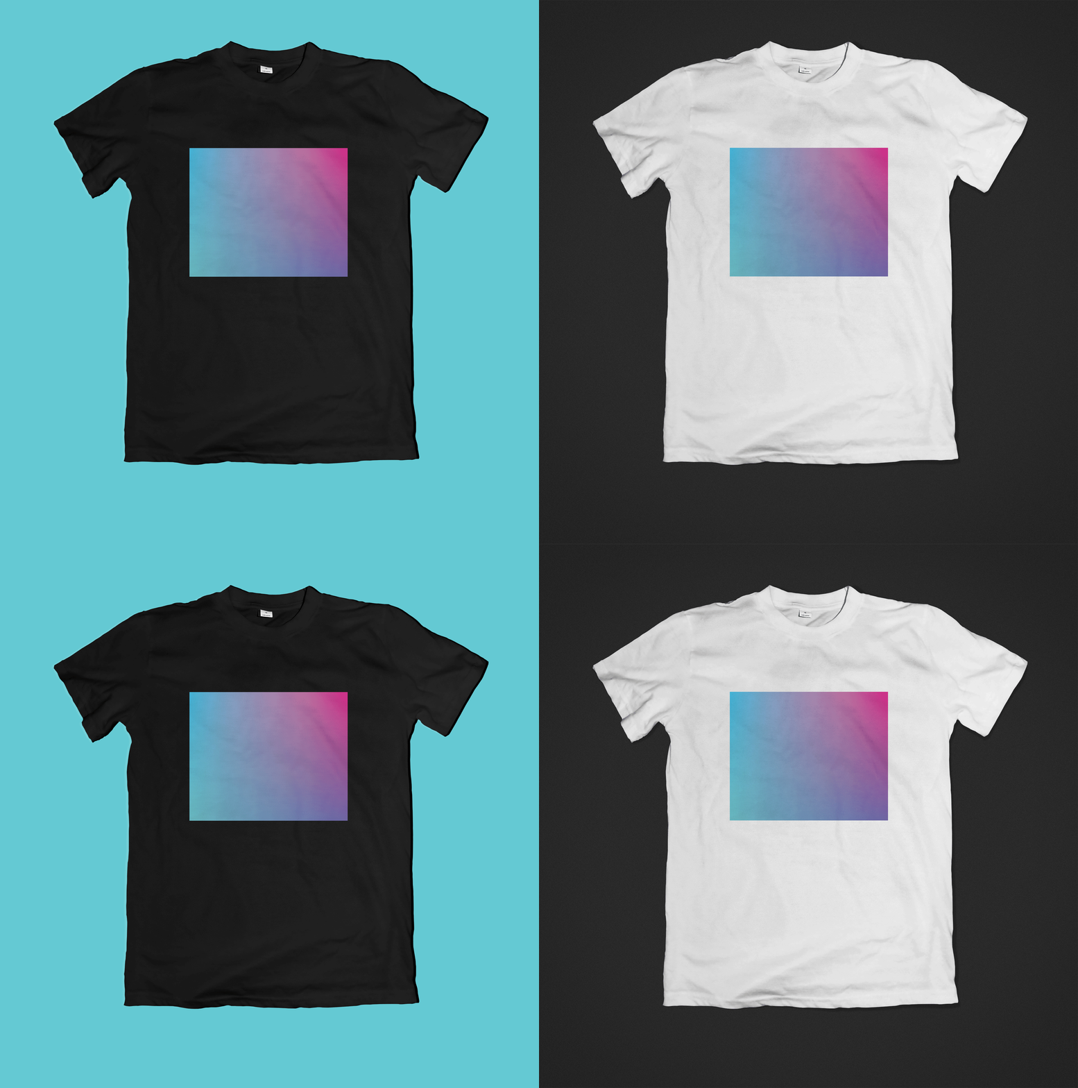
To give the festival identity an exciting and edgy vibe, the type lockup was created through experimentations with the scanner. Using a blue-to-pink gradient as a theme to symbolise the transcendence from reality, the unleashing of boundaries and the complete immersive experience one would feel at a festival.
-
Student project while at Shillington College.


